世界最大級のシェアを誇る水まわりのトップブランド「GROHE」
GROHE(グローエ)は1936年にドイツで誕生し、世界で初めてサーモスタット搭載の家庭用バス水栓を発売するなど、水栓金具のパイオニアとして機能的で高品質な製品を造ることに惜しみない努力と情熱を注ぎ続けています。
GROHE水栓は多くの高級ホテルやマンションなどで採用され、日本ではミンタやK7などグースネックのキッチン水栓が有名です。
当社GROHE MART(グローエ マート)はGROHEの正規販売代理店として15年以上の販売・施工実績がありますので、GROHE水栓のことでしたら、当社の専門スタッフにおまかせください。
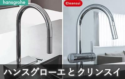
※ 当社ではハンスグローエのお取り扱い、また、クリンスイ(ビルトイン型浄水器)のパーツ交換・修理はお受けしておりません。予めご了承ください。
Campaign -キャンペーン-
お客様からたくさんの反響をいただいておりました、GROHE MARTの水栓交換キャンペーンが復活しました!通常でも定価より20%お値引きしていますが、それよりもさらにお値引きした特別価格にてご案内いたします。
期間は2026年9月30日のご依頼分までを予定しています。万が一在庫切れになった場合は、予告なくキャンペーンを終了する場合がございますのでご了承ください。
※出張取付対象商品につき、別途施工費+出張費がかかります。
 キッチン水栓 ミンタ
品番:3028020J
定価 108,020円 (税込)
当店割引価格より
さらに 10,616円OFF !!
特価:75,800円 (税込)
Line Up -商品一覧-
Kitchen
Bathroom
Lavatory
Showers

法人向けサービス
/*@media only screen and (min-width: 599px) {
.sp-on { display:none; }
}
@media only screen and (max-width: 599px) {
.pc-on { display:none; }
}*/
.section__block--top-page {
max-width: 1100px;
}
.pd-t25 {padding: 25px 0 0 0;}
.slider {
margin-top: 0;
}
.slider .bx-wrapper {
margin-bottom: 40px;
}
.slider .bx-wrapper .bx-caption {
text-align: center;
top: 0;
bottom: auto;
}
#slider img {
display: block;
margin: 0 auto;
}
.banner__section {
margin-top: 2px;
}
.news__lists {
list-style-type: none;
margin: 0 0 2em;
}
.news__list {
margin-bottom: .5em;
}
.news__date {
margin-right: 1em;
}
/* --- オリジナルStyle ---*/
.section__title-h2 {
text-align: center;
font-size: 2.5em;
font-weight: normal;
border-bottom: 1px solid #666;
margin: 2em 0;
padding-top: 0.1em;
padding-bottom: 0.1em;
}
.section__title-h2-com {
text-align: center;
font-size: 2.5em;
font-weight: normal;
border-bottom: none;
padding-top: 0.5em;
padding-bottom: 0;
margin: 1em 0 1em 0;
}
.section__title-h2-border {
text-align: center;
font-size: 1.5em;
font-weight: normal;
border-bottom: 1px dotted #666;
margin: 2 0 2em 0;
padding: 0 0 0.5em 0;
}
.section__p1 {
text-align: center;
font-size: 18px;
}
.banner-area {
overflow: hidden;
margin-top: 30px;
}
.banner-w {
float: left;
width: 48%;
margin-right: 1%;
margin-left: 1%;
margin-bottom: 40px;
}
.banner-3 {
float: left;
width: 31.3%;
margin-right: 1%;
margin-left: 1%;
}
.banner {
position: relative;
margin-right: 1%;
margin-left: 1%;
}
.banner p {
position: absolute;
text-align: center;
font-size: 18px;
text-align: center;
color: white;
bottom: 0px;
width: 100%;
background-color: rgba(0,51,102,0.6);
margin: 0px;
padding: 0px;
line-height: 2em;
display: block;
}
.banner-w span,
.banner-3 span,
.banner span{
line-height: 1.5em;
text-align: center;
display: block;
}
@media (max-width: 768px) {
.banner-w,.banner-3 {
float: none;
width: 98%;
}
.banner {
position: relative;
margin: 5px 1%;
}
.banner p {
font-size: 16px;
}
}
.banner img {
display: block;
height: auto;
max-width: 100%;
}
.othermenu {
overflow: hidden;
padding: 0;
margin: 0 0 30px 0;
}
.othermenu ul {
padding: 0px;
text-align: center;
margin: 0;
}
.othermenu li {
padding: 5px;
border-style: none;
margin: 0px;
display: inline-block;
}
div.top-nav1 {
position: relative;
max-width: 350px;
margin-right: 20px;
margin-left: 20px;
margin-bottom: 20px;
}
div.top-nav2 {
position: relative;
max-width: 350px;
margin-right: 20px;
margin-left: 20px;
margin-bottom: 0px;
}
div.top-nav1 p,
div.top-nav2 p {
position: absolute;
text-align: center;
font-size: 18px;
text-align: center;
color: white;
bottom: 0px;
width: 100%;
background-color: rgba(0,51,102,0.6);
margin: 0px;
padding: 0px;
line-height: 2em;
}
@media (max-width: 768px) {
div.top-nav1 p,
div.top-nav2 p {
font-size: 14px;
}
}
div.top-nav1 img,
div.top-nav2 img {
display: block;
height: auto;
max-width: 100%;
}
div.top-over {
max-width:350px;
max-height:350px;
overflow:hidden;
}
div.top-over1{
max-width:650px;
max-height:270px;
overflow:hidden;
}
div.top-over2 {
max-width:2000px;
max-height:270px;
overflow:hidden;
}
div.top-over img,
div.top-over1 img,
div.top-over2 img{
-webkit-transition: 0.3s ease-in-out;
-moz-transition: 0.3s ease-in-out;
-o-transition: 0.3s ease-in-out;
transition: 0.5s;
}
div.top-over img:hover,
div.top-over1 img:hover,
div.top-over2 img:hover{
-moz-transform: scale(1.1,1.1);
-webkit-transform: scale(1.1,1.1);
-o-transform: scale(1.1,1.1);
-ms-transform: scale(1.1,1.1);
}
span.top-mente-com {
font-size: 16px;
text-align: center;
font-weight: bold;
color: #082454;
}
@media (max-width: 768px) {
span.top-mente-com {
font-size: 12px;
text-align: center;
font-weight: normal;
}
}
.heght-auto {
height: 325px;
overflow: auto;
}
.top-news-box {
overflow: hidden;
border: 1px solid #666;
width: 96%;
margin-right: auto;
margin-left: auto;
}
.top-news-box .box-6 {
float: left;
width: 50%;
}
.heght-auto-news {
height: 200px;
overflow: auto;
}
.heght-auto-news1 {
height: 200px;
overflow: hidden;
}
@media (max-width: 768px) {
.top-news-box .box-6 {
float: none;
width: 100%;
}
.heght-auto-news1 {
height: 150px;
overflow: hidden;
}
}
.top-other-box {
overflow: hidden;
}
.top-other-box .row-box {
}
.top-other-box .box-6 {
float: left;
width: 50%;
}
@media (max-width: 768px) {
.top-other-box .box-6 {
float: none;
width: 100%;
}
}
p span.cate {
color: #FFF;
background-color: #06C;
padding-top: 0px;
padding-right: 7px;
padding-bottom: 0px;
padding-left: 7px;
line-height: 1.5em;
}
.ranking-row {
overflow: hidden;
width: 100%;
display: flex;
flex-wrap: wrap;
justify-content: left;
}
.ranking-col {
padding: 5px;
width: 22%;
margin-right: 1%;
margin-bottom: 15px;
margin-left: 1%;
border: 1px solid #999;
}
.ranking-col a {
color: #29ABE2;
}
@media (max-width: 768px) {
.ranking-col {
padding: 5px;
width: 42%;
margin-right: 1%;
margin-left: 1%;
overflow: hidden;
}
}
@media (min-width: 599px) {
.sp-on {
display: none;
}
}
em {font-style: normal;}
img.top-news {
width: auto;
height: auto;
}
.col-35per {
float: left;
width: 35%;
}
.col-65per {
float: right;
width: 65%;
}
.col-65per p {
line-height: 1.2em;
margin: 0px;
padding: 0em;
}
.col-35per p {
line-height: 1.2em;
padding-bottom: 2.5em;
}
@media (max-width: 599px) {
.col-35per,
.col-65per {
float: none;
width: 100%;
}
.col-35per img,
.col-35per p{
display: none;
}
}
.shopcom {
margin-bottom:5px;
}
@media (max-width: 599px) {
.shopcom {
margin-bottom:5px;
}
.section__title-h2-com {
font-size: 22px;
}
.section__p1 {
font-size: 13px;
}
}
.ichioshi {
clear: both;
display: flex;
}
.ichioshi .pricebox {
display: flex;
border: 1px solid #999;
padding: 10px;
}
.i-box-l {
width: 48%;
margin-right: 2%;
}
.i-box-r {
width: 48%;
margin-left: 2%;
}
.i-box {
width: 46%;
margin-right: 2%;
margin-left: 2%;
font-size: 18px;
text-align: center;
padding: 10px;
}
.i-box p.price {
font-size: 30px;
font-weight: bold;
color: #C00;
}
.ichioshi .pricebox em {
color: #FFF;
background-color: #C00;
display: block;
margin-bottom: 10px;
padding: 8px 15px;
}
p.ichioshiText {
line-height: 2em;
padding-top: 0.5em;
}
.ichioshi .contactbox {
display: flex;
padding: 10px;
justify-content: conter;
font-size: 21px;
}
.ichioshi .contactbox div {
width: 48%;
margin-right: 2%;
margin-bottom: 20px;
margin-left: 2%;
}
.ichioshi .contactbox a {
font-weight: bold;
color: #132539;
}
@media (max-width: 599px) {
.ichioshi,
.ichioshi .pricebox,
.ichioshi .contactbox {
flex-direction:column;
}
.i-box-l,
.i-box-r,
.i-box,
.ichioshi .contactbox div {
width: 100%;
margin-right: 0px;
margin-left: 0px;
}
p.ichioshiText {
line-height: 1em;
padding-top: 0.5em;
}
.i-box {
width: 100%;
margin: 0;
padding: 0;
}
}
.lineup {
/*margin-bottom: 30px;*/
overflow: hidden;
margin-right: auto;
margin-left: auto;
display: block;
}
h3.lineup__title-h3 {
background-color: #EEE;
text-align: center;
line-height: 2em;
}
.lineup .lineup-box {
/*width: 14%;*/
width: 22%;
margin-right: 1%;
margin-left: 1%;
text-align: center;
/*float: left;*/
line-height: 1.2em;
display: inline-block;
vertical-align: top;
}
.lineup .lineup-box:first-child {
margin-left: 2%;
}
.lineup .lineup-box:nth-child(5) {
margin-left: 2%;
}
.lineup .lineup-box img {
padding-bottom: 0.4em;
padding-top: 0.4em;
}
@media (max-width: 768px) {
.lineup .lineup-box {
/*width: 30%;*/
width: 46%;
margin-right: 1%;
margin-left: 1%;
text-align: center;
/*float: left;*/
font-size: 12px;
display: inline-block;
vertical-align: top;
}
/*.lineup .lineup-box:nth-child(4) {
margin-left: 2%;
}*/
.lineup .lineup-box:nth-child(3) {
margin-left: 2%;
}
.info-box {
border: 1px solid #F00;
text-align: left;
padding: 15px;
font-size: 17px;
width: 85%;
margin: 25px auto;
}
.info-box p,
.info-box h2{
padding: 3px 25px;
}
@media (max-width: 599px) {
.info-box {
font-size: 14px;
width: 95%;
}
}
.top-caution {
margin-top: 30px;
padding: 10px 20px;
background-color: #f0feff;
}
.top-cautionr b {
text-align: center;
}
.box16{
padding: 0.5em 1em;
margin: 2em 0;
background: -webkit-repeating-linear-gradient(-45deg, #f0f8ff, #f0f8ff 3px,#e9f4ff 3px, #e9f4ff 7px);
background: repeating-linear-gradient(-45deg, #f0f8ff, #f0f8ff 3px,#e9f4ff 3px, #e9f4ff 7px);
}
.box16 p {
margin: 0;
padding: 0;
}
iframe.youtube {
width: 100%;
height: auto;
aspect-ratio: 16 / 9;
}









 ユニバーサル
 アトリオ


